The internet is laughing at those viral “bad spacing” screenshots right now—menus that say “fried children” instead of “fried chicken,” signs that accidentally become risqué, and logos ruined by one misplaced gap. It’s light-hearted fun, but there’s a serious parallel hiding in plain sight: the same way poor spacing can destroy readability, poor “spacing” in your daily life can quietly destroy your back.
As people share screenshots from the viral Bored Panda compilation of design disasters that prove how important proper spacing really is, there’s a powerful lesson for anyone living with back pain. Your spine is, in many ways, a “design system.” Small details—angles, distances, gaps—can either create effortless elegance or chronic discomfort. And just as typographers obsess over kerning, you can cultivate a similar precision in the way you sit, stand, and move.
Below are five sophisticated, often overlooked “spacing insights” for the spine—each one inspired by the same meticulous attention to detail professional designers bring to beautiful, legible text.
Spatial Precision: The Millimeters That Decide Whether You Hurt
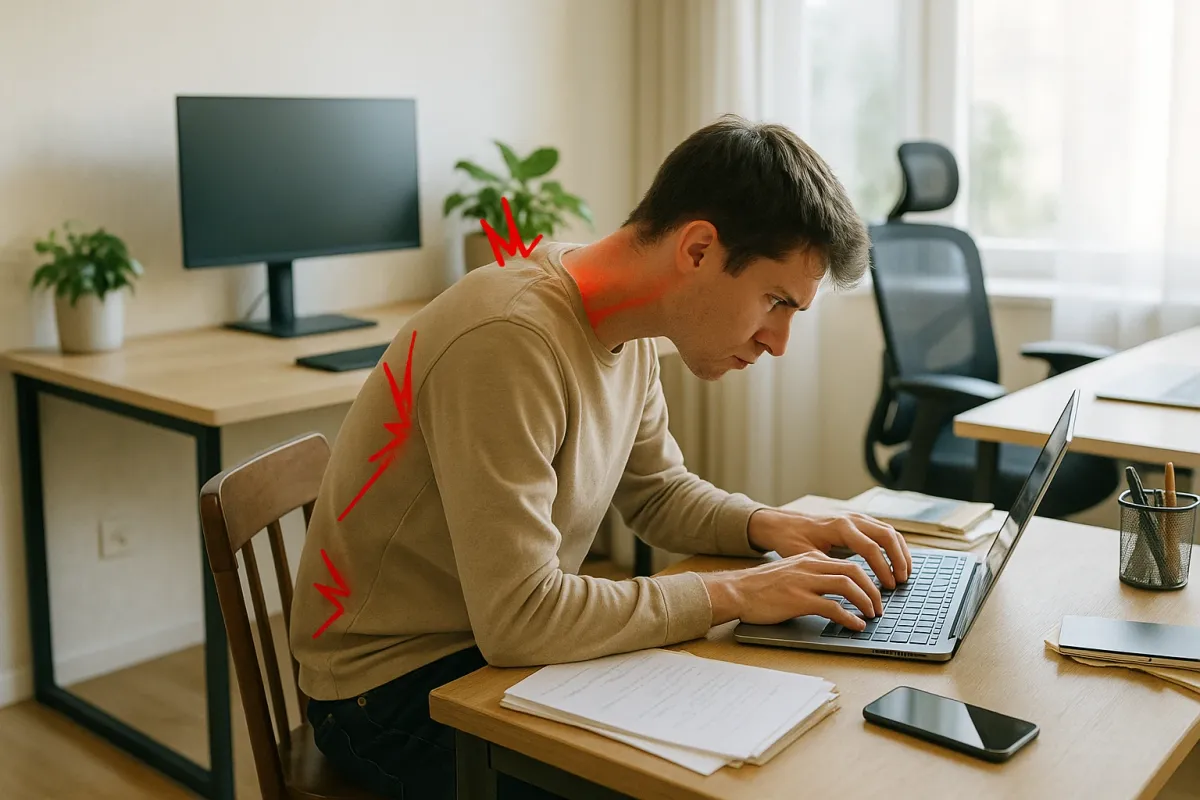
In typography, a few millimeters between letters can change a word from clear to catastrophic. Your spine operates with that same sensitivity. Research in ergonomics shows that seemingly trivial changes—the height of your monitor, the distance of your keyboard, the angle of your hips—meaningfully shift the load on your lumbar discs and the tension across key muscles like the multifidus and erector spinae.
For back pain, this means you must graduate beyond generic advice (“sit up straight”) and into calibrated spatial precision. Instead of “a chair with lumbar support,” think: “my lumbar curve is gently supported at the level of L3–L4, with my pelvis slightly anteriorly tilted and my weight centered over my sit bones.” Instead of “desk at elbow height,” think: “desk high enough that my shoulders stay relaxed, but low enough that my wrists remain straight, not extended.” This mindset reframes your environment from a given to be endured into a system to be exquisitely tuned—just as a designer would adjust letterspacing until a line feels visually effortless.
Negative Space: The Luxurious Role of Micro-Breaks
Designers speak reverently about “negative space”—the empty area that allows the eye to rest and the message to breathe. Chronic back pain, particularly in high-achieving professionals, often arises from a life with no negative space at all: hours of emails, back-to-back calls, a commute with your spine folded into a seat designed for the average, not for you.
The contemporary research on sedentary behavior is unequivocal: prolonged, uninterrupted sitting is strongly associated with increased musculoskeletal pain and stiffness. The refinement lies not merely in “standing more,” but in curating graceful micro-breaks as if you were arranging white space on a page. Every 25–40 minutes, insert 60–120 seconds of decompression: a brief walk, a slow spinal roll-down, a gentle hip-flexor stretch, or simply standing and letting your arms hang heavy while you breathe into the back of your ribs. These are not interruptions to productivity; they are the white space that keeps your spinal “text” readable by the end of the day.
Postural Kerning: Fine-Tuning How Body Segments “Sit” Together
Those “cursed spacing” examples going viral underscore how letters that are technically in the right order can still sit disastrously together. Your posture often fails in exactly that way—not because any one segment is wrong, but because the spacing between your segments is poorly managed.
Think of your body in discreet but harmonized units: feet, lower legs, thighs, pelvis, rib cage, head. Postural kerning is the art of adjusting how those units “sit” relative to one another:
- Feet grounded directly under knees, not tucked back under your chair.
- Knees slightly lower than hips, allowing the pelvis to tilt forward instead of collapsing backward.
- Rib cage stacked gently over the pelvis, not thrust forward (military posture) or sagging back (slouched posture).
- Head balanced over the sternum, not protruding like a “forward-leaning character” on your neck.
These are subtle shifts, but they massively reallocate load away from overworked regions (like your lumbar discs and upper trapezius) and toward the powerful, endurance-capable muscles of the hips and core. A skilled physiotherapist, Pilates instructor, or movement specialist can serve as your “typographer for posture,” helping you identify and refine the spacing between these segments so the entire composition becomes both elegant and sustainable.
Environment as Typography: Curating a Spine-Friendly Visual Field
Those viral images of unfortunate signage layouts are a masterclass in how environment shapes perception. The same principle applies to your back: what you look at, and where it is placed, will dictate the angles your neck and spine are forced to adopt—often for hours.
Premium spinal care begins with a visually curated environment. Your primary screen should be at or just below eye level, centered with your body, to avoid constant rotation or flexion. Secondary screens should be aligned, not off to an extreme side that encourages ongoing neck rotation. Documents belong on an adjustable stand, not flat on the desk. Even the art hung in your workspace matters; if your favorite piece sits off to one side, you may be subconsciously turning toward it dozens of times a day. By aligning your visual field, you minimize the micro-twists and micro-tilts that compound over time into tension headaches, neck pain, and upper-back fatigue. Think of it as designing a layout for your eyes and spine, ensuring every visual element is positioned with deliberate care.
Intentional Movement: Editing Out “Clumsy” Spinal Moments
In graphic design, a polished final product often emerges only after multiple rounds of editing—removing awkward line breaks, clumsy overlaps, and visual noise. Back health demands the same editorial discipline. Many people’s most damaging spinal moments are not the obvious heavy lifts, but the careless transitions: twisting to grab a bag from the back seat, rounding forward to pick up a dropped pen, folding over their phone in bed.
Bring an editor’s mindset to these moments. When you reach for something low, hinge from your hips while maintaining a long spine, rather than collapsing through your mid-back. When you twist, rotate from the whole torso and hips instead of corkscrewing at a single spinal level. When you carry a bag, alternate sides or choose a backpack-style design that distributes load symmetrically. None of this requires gym-level effort—it requires awareness, rehearsal, and a quiet determination to move beautifully, especially in the most mundane tasks. Over time, this intentionality transforms your daily life into a choreographed sequence that protects rather than punishes your spine.
Conclusion
The internet’s fascination with “bad spacing” in design is a reminder that small details are not trivial; they are everything. Just as one misplaced gap can turn a respectable sign into a viral joke, one neglected detail in your daily “spinal layout” can, over months and years, turn a healthy back into a source of relentless complaint.
Exquisite back care is not about living in fear of movement or surrounding yourself with expensive gadgets. It is about adopting the designer’s eye—attentive to spacing, alignment, negative space, and elegance in execution—and applying it to your body. When you do, your spine ceases to be a problem to manage and becomes, instead, a quietly refined foundation for how you work, move, and live.
Key Takeaway
The most important thing to remember from this article is that this information can change how you think about Back Health.