If a misplaced space can ruin a word, a misplaced inch can ruin a spine.
As design accounts on Instagram and Reddit amplify hilariously “cursed” spacing mistakes—many of them now trending via Bored Panda’s feature on poor kerning and layout—one quiet truth emerges: what feels “off” to the eye is often a perfect metaphor for what’s off in our physical environment. The same way awkward typography makes text harder to read and more exhausting to process, awkward workstation design makes your body work harder just to exist in a chair.
In other words, we instinctively mock bad spacing on a sign, but we tolerate bad spacing around our spine all day.
Inspired by the current wave of viral design fails, this piece reframes ergonomics through the lens of spacing, alignment, and micro‑details. For those living with back pain—or those determined never to join that club—these five insights will help you curate a workspace where every inch quietly supports your spine, instead of sabotaging it.
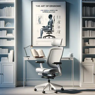
1. The Typography of Your Spine: Alignment Is Your True Baseline
Designers obsess over baselines in typography—the invisible line that letters sit on. Your spine deserves the same reverence.
For refined back care, treat your body as a carefully typeset page. Your ears, shoulders, and hips should form a near‑vertical line when seated, just as letters rest on a common base. When screens are too low, keyboards too far, or chairs too deep, your “baseline” warps: your head tilts forward, shoulders round, and your lumbar curve collapses. Over hours, this misalignment behaves like poorly set text—harder to read, harder to navigate, incrementally more exhausting.
Practical refinement:
- Position your screen so the top third is near eye level.
- Sit so your hips are slightly higher than your knees, allowing the pelvis to tip very gently forward, preserving the natural lumbar curve.
- Allow your shoulder blades to rest back and down—not pinned, just unforced and supported by the chair’s backrest.
Think of it as premium typesetting for your posture: clean, deliberate, and gloriously unstrained.
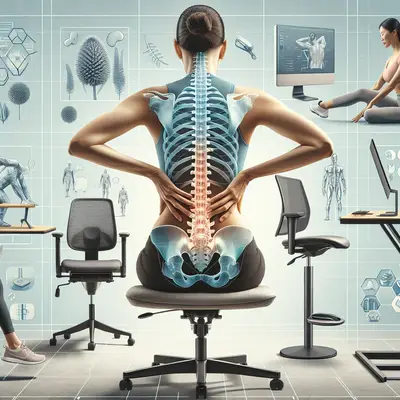
2. Micro‑Spacing, Macro Consequences: The Hidden Distances That Create Pain
The viral design examples of disastrous word spacing show how a gap of just a few millimeters can alter meaning entirely. In ergonomics, similarly tiny distances—between your hands and keyboard, your back and chair, your feet and floor—quietly determine whether you end your day comfortable or inflamed.
Three micro‑spaces to refine with surgical precision:
- The Back Gap
If there is a visible gap between your lower back and the chair’s lumbar support, your spine is essentially “free‑floating,” forced to hold itself up all day. Slide your hips fully back into the seat, and adjust the lumbar support so it nestles into your natural curve rather than pushing aggressively against it.
- The Reach Zone
An elite workstation has a “primary reach zone”: where your forearms rest comfortably at about 90° and your wrists remain neutral. Keyboard and mouse belong in this zone. If you have to reach forward or outwards, your shoulder girdle tenses—subtle at the moment, punishing over months.
- The Foot Contact
If your feet are not fully grounded, your legs search for stability by clutching at your lower back and hips. A footrest (or even a stable box, elegantly disguised) converts dangling legs into a stable, supported base, relieving the spine above.
In the same way a single bad space can ruin the best logo, a single neglected gap can undermine an otherwise exquisite chair.
3. Cognitive Load and Chair Load: Why Visual Noise Exhausts Your Spine
The trending screenshots of chaotic, cramped typography are more than comedy; they are a lesson in cognitive load. When design is visually stressful, the brain works harder. When ergonomics are physically stressful, the same principle applies to your musculoskeletal system.
A refined back‑friendly environment is visually and physically legible:
- Visual clarity lowers unconscious tension. A cluttered desk often produces subtle forward‑leaning, constant neck rotation, and micro‑shifts as you hunt for objects. A curated, minimal surface line allows the eyes and neck to remain composed.
- Predictable reach paths—where the items you use constantly (phone, notebook, pen, water glass) live in consistent locations—reduce twisting and reaching. Over months, erratic movement patterns compound into irritation of the facet joints, discs, and surrounding musculature.
- Lighting that flatters, not fatigues is also ergonomic. Glare or dim lighting pulls your head toward the screen, dragging the cervical spine forward. Invest in a high‑quality, adjustable task light with warm, diffuse illumination. Think of it as mood lighting for your vertebrae.
We laugh at bad spacing online because it feels jarring. If your workstation elicits the same internal flinch, your back is likely paying the bill.
4. Dynamic Posture: Why a “Perfect Setup” Still Fails a Living Spine
One of the subtler lessons from design is that static perfection quickly feels lifeless. The most compelling layouts have rhythm—purposeful variation within a cohesive grid. Your spine thrives on a similar principle: orchestrated movement within a well‑designed frame.
A luxurious workstation is not a shrine to stillness; it is a stage for graceful variation.
Refined back‑care practices to integrate:
- Micro‑movements every 20–30 minutes:
Shift your weight slightly, tilt your pelvis forward and back, or gently roll your shoulders. The motion can be almost imperceptible—this is not a workout; it’s circulation maintenance.
- Alternating postures:
If you have a height‑adjustable desk, think 2–3 posture “chapters” per hour: seated upright, seated slightly reclined with full back contact, then briefly standing with one foot elevated on a small footrest to unload the lumbar spine.
- Intentional intermissions:
Once every 60–90 minutes, stand, walk for one minute, and perform a single refined stretch, such as a gentle hip flexor opening or a supported back extension with hands on the hips. These micro‑rituals preserve disc hydration and calm overactive spinal muscles.
Chasing a single “perfect posture” is like insisting one font size fits every word. Superior ergonomics is a choreography, not a freeze‑frame.
5. The Luxury of Intentional Design: Curating a Spine‑First Workspace
The internet’s fascination with ridiculous real estate listings and bizarre interior choices—now widely shared and dissected—highlights one truth: not all design is intentional. Many spaces simply happen. Premium back care begins when you refuse to let your workspace “just happen” around you.
Curating a spine‑centric environment means applying a designer’s eye and a clinician’s rigor:
- Start with function, then indulge in form.
Confirm the essentials: chair height that allows 90–100° at the knees, arm supports at or just below elbow height, screen within arm’s reach, and keyboard/mouse within the primary reach zone. Once the fundamentals are correct, elevate aesthetics—textures, colors, and objects that invite calm rather than clutter.
- Eliminate the ergonomic “optical illusions.”
Many chairs look supportive but fail in critical areas: too deep a seat pan, non‑adjustable lumbar curve, armrests that flare outward, or a backrest that leans but does not truly support. Test your chair with a simple question: Can you fully relax your back into it and type without your shoulders creeping upward or your neck jutting forward? If not, the design is decorative, not therapeutic.
- Create a personal “back etiquette” policy.
- No laptop work in bed without external keyboard and elevation.
- No phone browsing with head fully flexed; elevate the device to at least chest level.
- No more than 30 minutes of couch‑slouching without a deliberate reset—standing, stretching, or repositioning with lumbar support.
In the same way brands adhere to style guides, adopt a personal posture guide:
This is ergonomics as a lifestyle standard, not an afterthought—a quiet luxury that pays dividends every hour you spend sitting, standing, or moving through your day.
Conclusion
The recent wave of viral design fails—mis‑spaced words, chaotic layouts, and visual disasters—has entertained millions. Yet behind the humor lies a reminder uniquely relevant to back care: details matter. A few millimeters of misjudged spacing can distort meaning on a sign; a few inches of misjudged distance at your desk can distort the health of your spine.
Treat your workspace as an exercise in high design, where every line, angle, and surface is curated with the same care a typographer gives a luxury print layout. When alignment becomes intentional, micro‑spacing becomes respectful, movement becomes rhythmic, and your daily environment starts to support you as elegantly as it looks.
Your back is reading every design decision you make. Ensure the story you’re telling it is one of precision, comfort, and long‑term resilience—worthy of the life you intend to live in that spine.
Key Takeaway
The most important thing to remember from this article is that this information can change how you think about Ergonomics.